Coffee Shop Infographic with Power BI
Objective
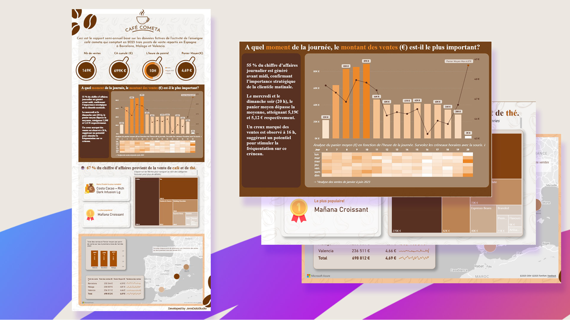
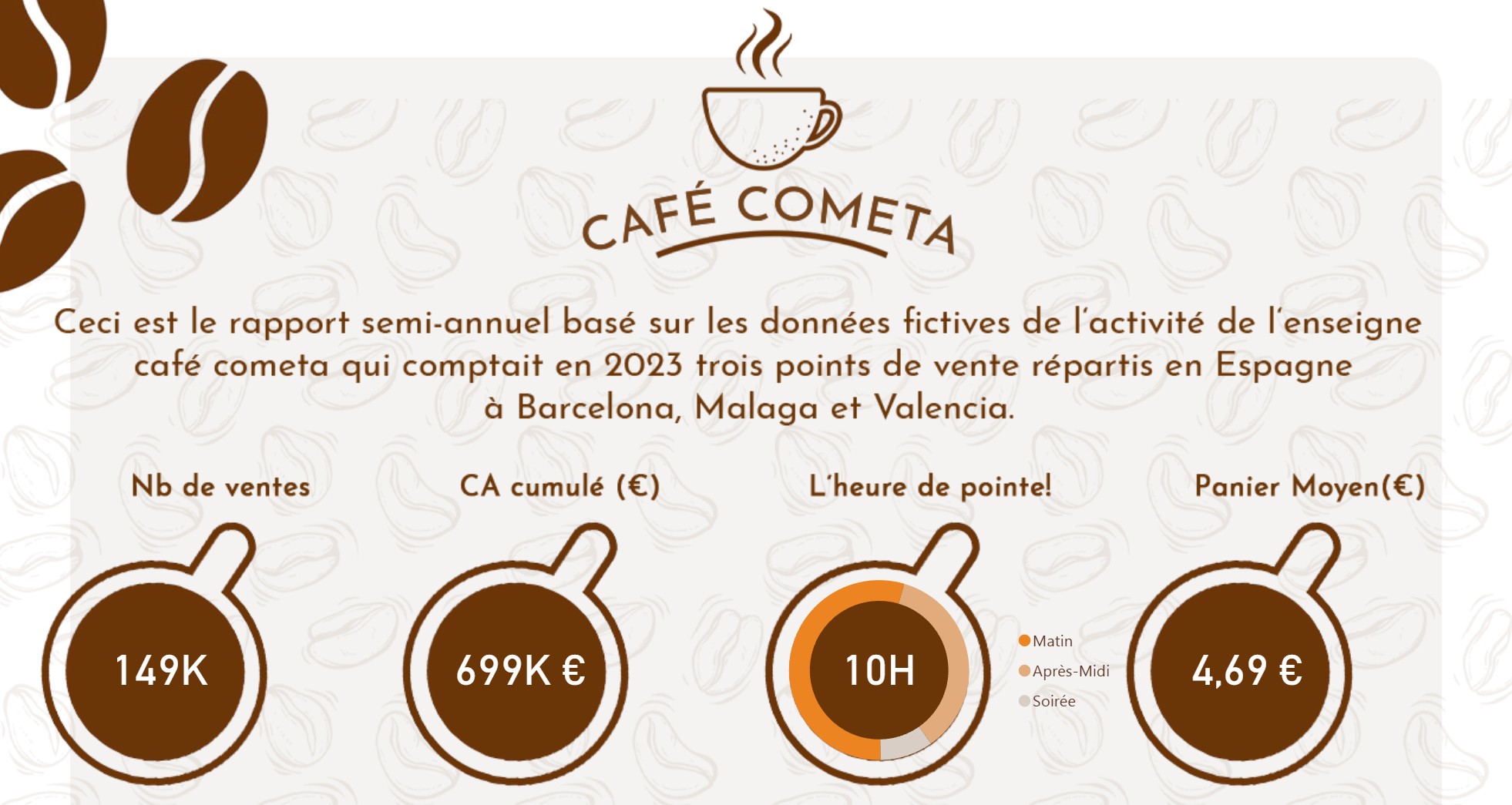
Design a visually engaging dashboard in French to provide the founders and management team of a newly launched coffee shop with a clear overview of key business metrics. The goal is to support strategic decision-making during the brand’s first six months of operations.
Audience
This dashboard is intended for French-speaking founders and managers operating in Spain. It caters to non-technical users by presenting data in a playful, infographic-style format that’s both intuitive and easy to interpret.
Data & Sources
The dashboard is built using operational data (csv files) from the coffee shop’s first six months of activity. The data was cleaned and modeled to ensure consistency and relevance for early-stage business insights.
Solution
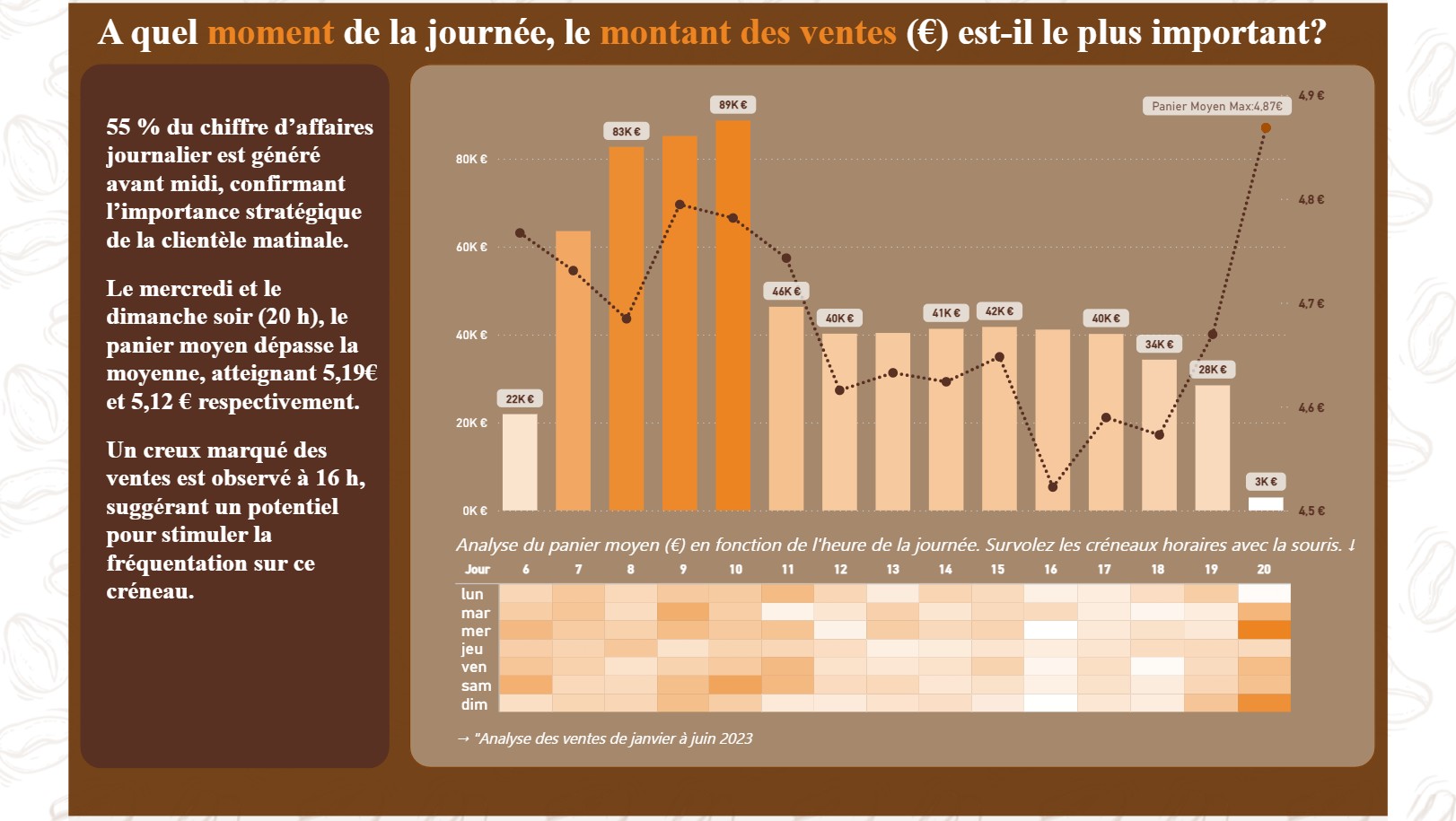
To make the dashboard both functional and fun, it was designed as an infographic using Power BI and enhanced with custom visuals created in Photoshop. The layout emphasizes storytelling and accessibility, allowing users to explore performance trends without needing technical expertise.
Impact
By transforming raw business data into a visually compelling dashboard, this project empowers the coffee shop’s leadership to monitor growth, identify opportunities, and make informed decisions quickly. It also sets a strong foundation for future data-driven strategies as the business scales.
Tools & Techniques
- Power BI and DAX: For data modeling, visualization, and interactivity
- Adobe Photoshop: For custom icons, layout design, and visual polish
- Infographic Design Principles: To enhance engagement and simplify complex data
- French Language Interface: To align with the cultural and linguistic background of the founders
Live Dashboard Demo
Click below to explore this interactive Dashboard and experience it.
Ready to turn your data into decisions?
Tell me more about your project and needs.
JennDataStudio
contact
Links
Curabitur non nulla sit amet nisl tempus convallis quis ac lectus. Nulla porttitor accumsan tincidunt. Curabitur


