Power BI Wine Dashboard

Objective
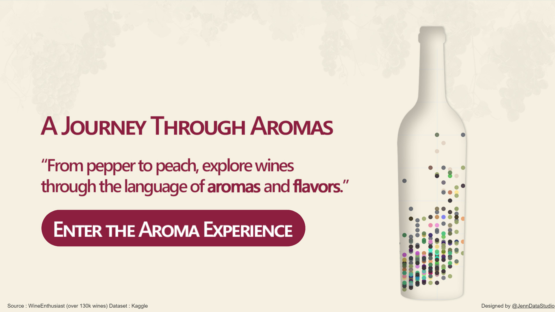
The goal of this project was to design an immersive sensory exploration tool for wines. Instead of the usual filters (country, price, variety), the entry point is the aromas described in professional wine reviews. This approach sets the experience apart from conventional dashboards and highlights how data visualization and UX design can be used to create a more engaging and intuitive journey.
Audience
This dashboard is primarily targeted at wine enthusiasts who wish to discover wines through their aromatic profiles. It could also be of interest to wine e-commerce platforms, oenological magazines, and data-driven brands such as Wine Enthusiast, who are looking for innovative ways to present and interact with their catalogs.
Data & Sources
The dataset was sourced from Kaggle, based on over 130,000 wine reviews published by Wine Enthusiast. The data was provided in CSV format and enriched with a custom aroma dictionary, which I built by extracting key phrases from review texts using Python (KeyBERT).
Solution
The solution combines data modeling, analytics, and UX design to deliver a multi-layered interactive dashboard.
-
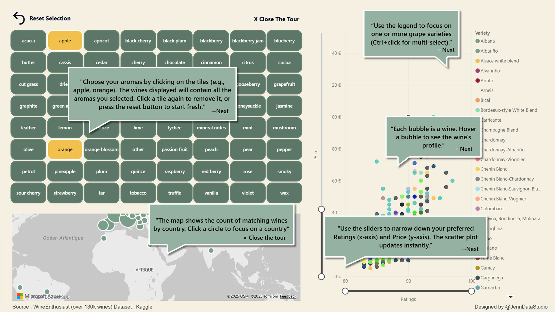
Users can select one or more aroma tiles (e.g., peach, orange, ) to filter wines dynamically.
-
A scatter plot bubble chart visualizes wines based on rating and price, helping users spot patterns.
-
An interactive map displays the geographic distribution of wines and allow to filter on country.
-
The grape variety legend as filter adds another layer of exploration.
-
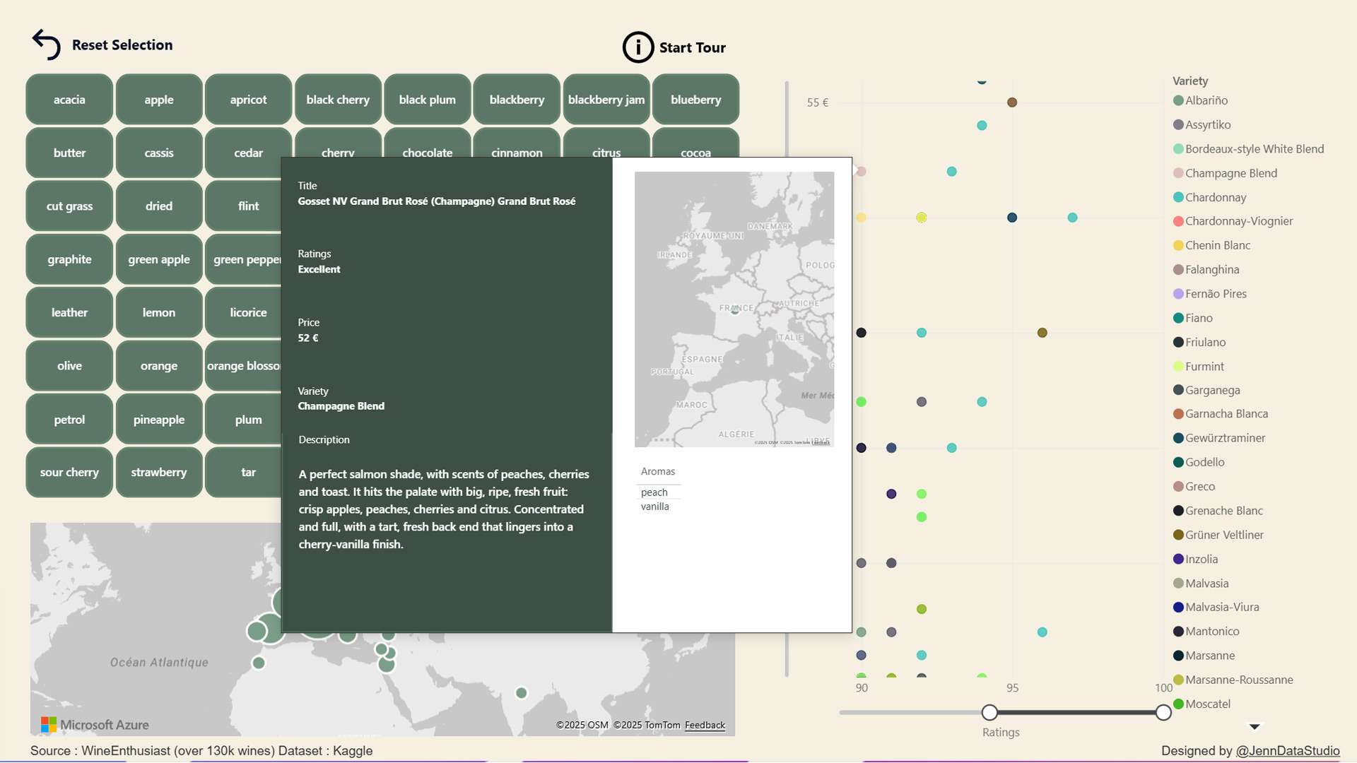
Enhanced custom tooltips present tasting notes, ratings category and a mini-map for each wine.
The underlying star schema supports a multi-aroma filter, a non-trivial DAX logic that ensures only wines matching all selected aromas are displayed.
Impact
The result is an immersive and intuitive experience where users can explore wines in a way that feels natural and inspiring. By placing aromas at the center of the interaction, the dashboard offers a fresh perspective on wine discovery, bridging data storytelling and sensory exploration. For brands, this kind of tool could significantly increase engagement and differentiation in digital wine experiences.
Tools & Techniques
-
Power BI Desktop: dashboard design, DAX measures, data modeling (star schema), custom tooltip
-
Python (KeyBERT): aroma extraction and dictionary creation
-
Photoshop: UI elements and visual design enhancements
-
UX/UI Design: wireframing, guided tutorials, user interaction design
Live Dashboard Demo
Find the wines suited to your palate!
Ready to turn your data into decisions?
Tell me more about your project and needs.
JennDataStudio
contact
Links
Curabitur non nulla sit amet nisl tempus convallis quis ac lectus. Nulla porttitor accumsan tincidunt. Curabitur


