Where Numbers Make Sense
I Transform Your Data Into Interactive & Visually Engaging Dashboards
I create Tailored Dashboard to Turn your Data Into Decision


Your Data Has a Story. Let’s Tell It Right.
You’re sitting on tons of data — sales, operations, performance metrics… but without the right tools, it’s just noise.
At JennDataStudio, I help businesses turn messy spreadsheets and scattered dashboards into clear, visual stories that actually make sense. So managers can finally see what’s working, what’s not, have an overview of activities and where to go next.
No jargon. Just smart, visual insights to drive better decisions.
Case Studies
Featured Use Cases
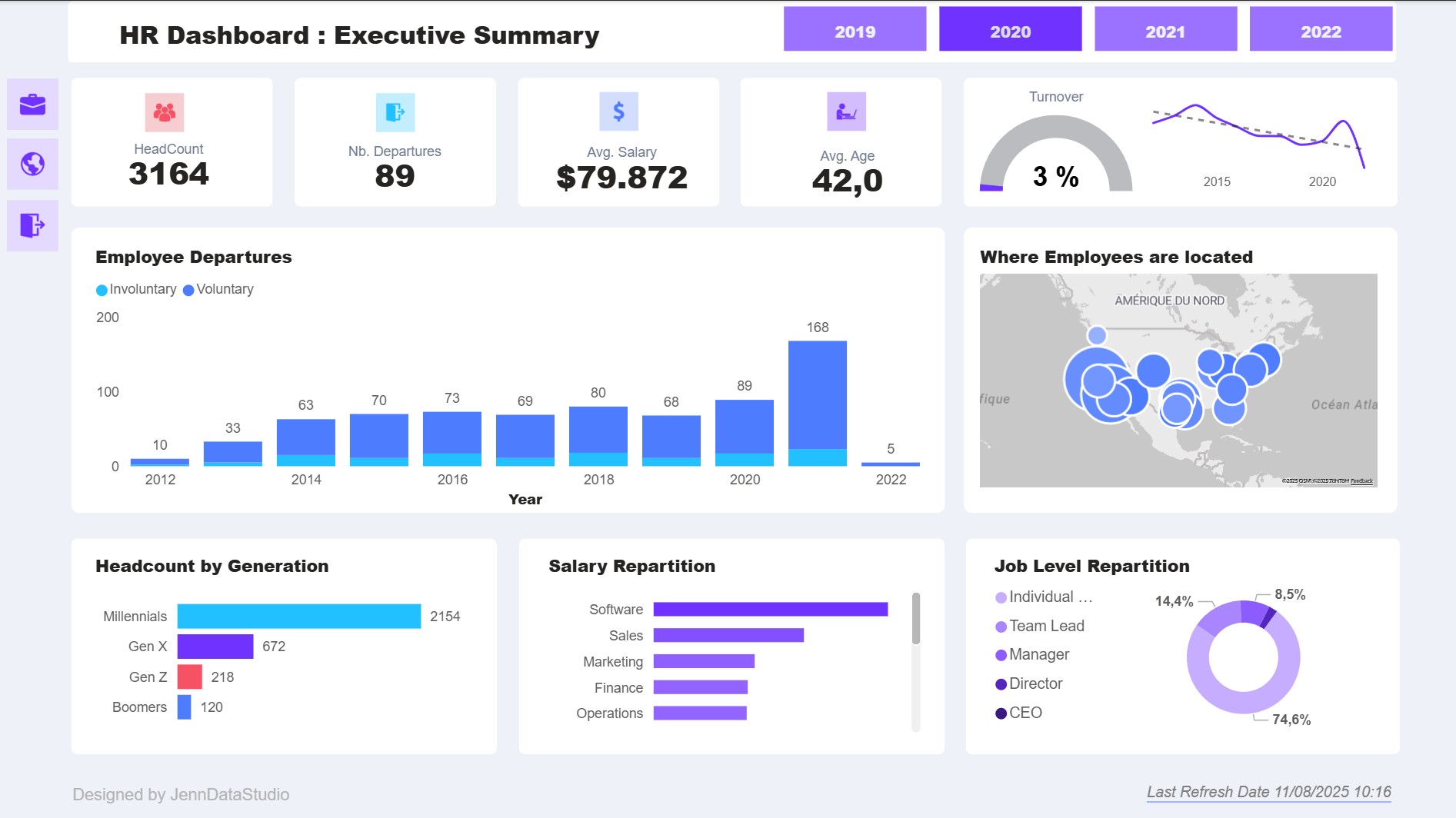
Discover practical examples of how our dashboards can transform data into actionable insights. Explore real scenarios where efficiency, clarity, and smart design make all the difference.
The 4 Pillars of an Effective Dashboard
Not just pretty charts — a truly useful dashboard helps teams make faster, smarter decisions. Here’s what it takes:

Relevance – Show What Matters, to Whom
A dashboard is only as good as its focus. Who is it for — a manager, a sales team, the CEO? What questions do they need answered? A great dashboard filters out the noise and highlights the data that’s truly meaningful for its audience.

Clarity – Make It Instantly Readable
Good design isn’t decoration — it’s a tool. With smart use of layout, color, and spacing, your dashboard should guide the eye and make key insights obvious at a glance. No need to scroll, guess, or zoom in.


Context – Tell the Story Behind the Numbers
Numbers don’t speak for themselves. Trends, comparisons, benchmarks — these give your data meaning. A great dashboard connects the dots and helps users understand not just what is happening, but why.

Actionability – Drive Real Decisions
A dashboard is not a report. It’s a tool for action. Whether it’s spotting a drop in performance or identifying a new opportunity, it should clearly point to the next steps — not leave users wondering what to do with the information.
My Process
How We Work Together
A simple, structured process — from first insights to adoption.
Every project is unique, but the path is always clear.
1. Understand Your Needs
We start with deep listening: your business questions, your data sources, your workflows. The goal? Identify what matters — and for whom — so the dashboard serves real decisions, not just displays data.
2. Design & Build
I create mockups to validate the structure and layout. Once approved, I collect, clean and prep the data — then build a custom dashboard in Power BI, fully tailored to your goals.
3. Support & Iterate
Once delivered, I support your Power BI Users: quickstart sessions, feedback collection, and revisions if needed. I also offer coaching to help your team get the most value from the dashboard over time.
Meet Jennifer
Hi, I’m Jennifer — a Microsoft Certified Power BI Data Analyst Consultant Freelance, as well as a Polytechnic Engineer from the Louvain School of Engineering, with a background in Applied Mathematics.
I have over 10 years of experience in data and software engineering consulting, helping companies make sense of their numbers.
But I’m also a visual thinker. For the past 8 years, I have been helping small businesses shine by offering impactful visual communication solutions.
Today, I’m excited to bring both worlds together: Data and Design.
I’m passionate about creating dashboard designs that are not only visually appealing but also tell a story — empowering management and teams to make informed decisions.
I am based in Spain, one hour from Barcelona, and work both remotely and on-site in Catalonia, France or Belgium.
I speak French and English.
Ready to turn your data into decisions?
Tell me more about your project and needs.
JennDataStudio
contact
Links
Curabitur non nulla sit amet nisl tempus convallis quis ac lectus. Nulla porttitor accumsan tincidunt. Curabitur


